Most productivity apps fail in the same place: the moment you pick up your phone.
That is why the search for a minimalist productivity app iPhone users can actually live with is not really about clean design. It is about behavior. If an app looks simple but keeps pulling you back into menus, settings, streaks, and endless check-ins, it is not minimal. It is just dressed better.
A good minimalist app on iPhone should help you do one thing well: decide what matters, start, and stay with it. No clutter. No fake busyness. No confusing system you need to manage before you can begin.
What a minimalist productivity app for iPhone should actually do
Minimalism in productivity is not white space and pretty icons. It is less friction between intention and action.
On iPhone, that matters even more because the device itself is a distraction machine. Every notification, badge, and app switch is a chance to lose the thread. So the best minimalist productivity app for iPhone is the one that reduces decisions while you work, not the one that gives you the most features.
That usually comes down to four things. It should be fast to start, obvious to use, hard to misuse, and honest about what happened. If you need five taps just to begin a focus session, that is friction. If it lets you feel productive without showing how you spent your time, that is theater.
Minimalism also has trade-offs. Some people genuinely need complex project management, team collaboration, or layered automations. If you are running a large operation, a minimalist app may feel too narrow. But if your main problem is scattered attention, too much software is often part of the problem.
The trap: simple-looking apps that create more screen time
A lot of apps market themselves as minimalist because the interface is clean. That is not enough.
The real test is what the app asks you to do after you open it. Does it push you into organizing tags, customizing workflows, sorting templates, and reviewing dashboards all day? Or does it get out of your way?
This is where many iPhone productivity apps break down. They turn productivity into another phone activity. You spend more time maintaining the system than doing the work. You check your app to feel in control, but your attention stays fragmented.
If your goal is better focus, the app should reduce phone interaction during work, not increase it. That sounds obvious. It rarely happens.
The best minimalist productivity app iPhone users need depends on the job
There is no single perfect app for everyone. It depends on what kind of friction you are trying to remove.
If you forget priorities, a simple task list may be enough. If you struggle with starting, a timer-based app is usually better. If you start easily but drift after ten minutes, you need stronger session accountability. If your week feels busy but unproductive, tracking by session and activity matters more than a long to-do list.
That is the key distinction. Some apps help you plan. Some help you act. Many people do not have a planning problem. They have an execution problem.
For that group, minimalism should look like this: choose the task, start the timer, put the phone down. The app should support the habit, not become the habit.
Why timer-based focus often works better than task clutter
A task list tells you what you hoped to do. A timer tells you what you actually did.
That difference matters. Plenty of people have beautifully organized lists and still end the day wondering where the time went. A minimalist productivity app on iPhone works best when it gives structure to behavior, not just storage for intentions.
Timer-based systems are effective because they create a clear start and stop. They lower resistance. They also make distraction visible. If you say you are doing 30 minutes of writing, then the session either happened or it did not. That kind of honesty is useful.
The strongest version of this approach is not a timer with ten modes and ambient themes. It is a timer tied to discipline. Start the session. Leave the phone alone. Return when the work block ends.
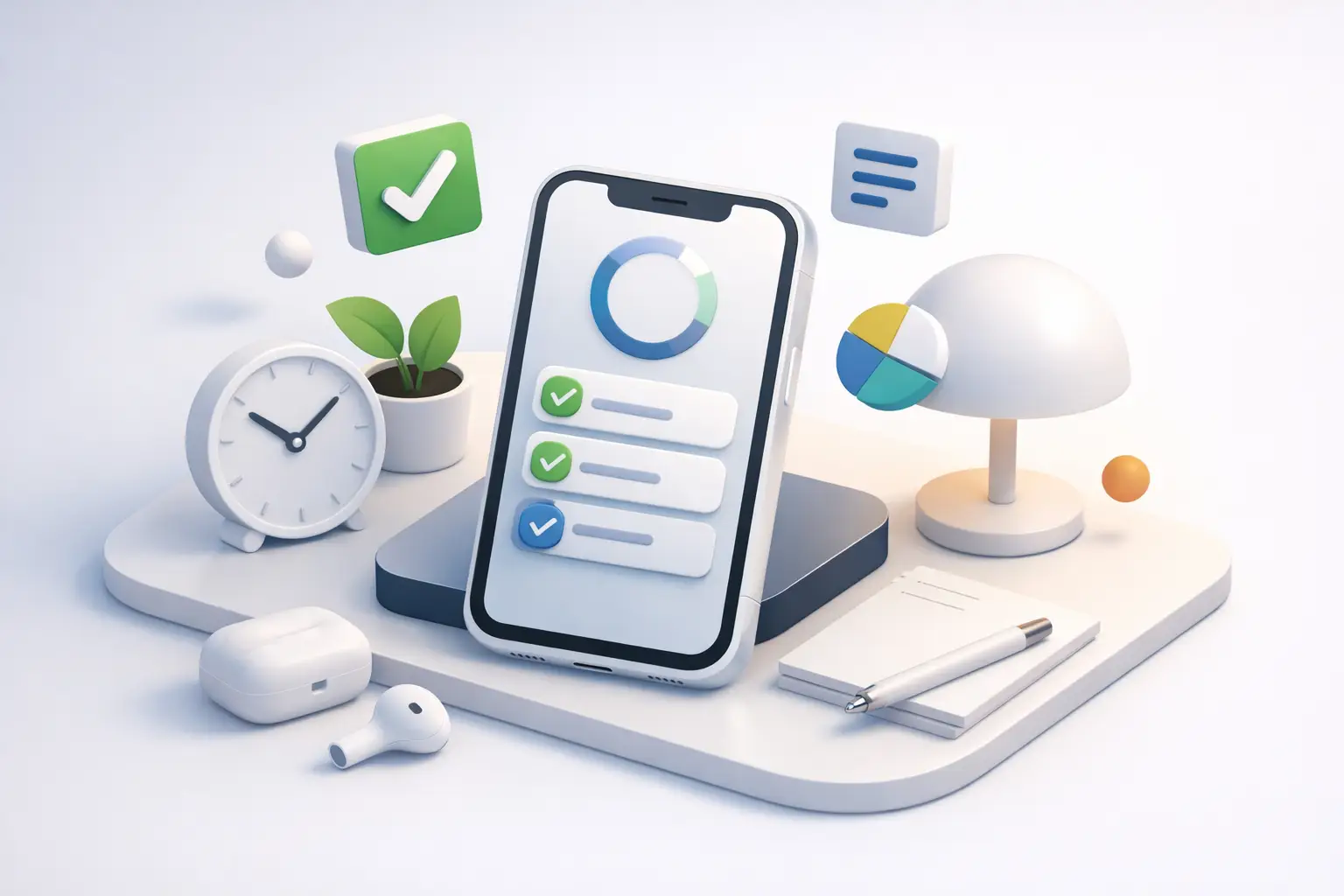
That is where an app like Tupp fits naturally. It is minimal in the right way. You start a session, put the phone down, and let the timer hold the boundary. The value is not in giving you more to fiddle with. The value is in making focused time visible across iPhone, Apple Watch, widgets, and the lock screen so you can stay accountable without falling back into the app.
Features that matter more than aesthetics
A clean interface is nice. A clean workflow is better.
When choosing a minimalist productivity app for iPhone, pay attention to how quickly you can move from thought to action. Can you start from a widget? Can you check progress from the lock screen without getting pulled back into your phone? Can you review your week in a way that shows patterns instead of vanity metrics?
Good minimal apps also respect context. On iPhone, that means small actions, glanceable status, and limited taps. On Apple Watch, it means quick visibility. On the web, it means a broader weekly view when you are ready to reflect. The point is not to add more surfaces. The point is to reduce friction across them.
Another feature that matters is activity-based tracking. Not every hour of work is equal. If you can see how much time went to studying, writing, admin, training, or client work, you stop guessing. You can adjust based on real behavior.
What matters less than people think? Endless customization. Theme packs. Complex goal trees. Gamified noise. These features are not always bad, but they often distract from the real job.
Minimalism is not about doing less. It is about wasting less.
This is where people get confused.
A minimalist app is not supposed to make your system cute. It is supposed to strip away what does not help. That includes unnecessary features, but it also includes unnecessary self-deception.
If your app gives you a satisfying sense of progress without requiring focused work, it is not helping. If it lets you check boxes all day while your important work stays untouched, it is helping you avoid the truth.
The right app should expose the gap between your plan and your behavior. That can be uncomfortable. Good. Useful tools are not always flattering.
For students, that may mean seeing how little uninterrupted study time actually happened this week. For freelancers, it may mean realizing admin swallowed the day. For creators, it may mean understanding that “research” was mostly drift. Honest tracking beats optimistic memory.
How to choose without overthinking it
Pick based on the problem that hurts most right now.
If your issue is overwhelm, choose the app that simplifies your next action. If your issue is distraction, choose the one that reduces screen interaction during work. If your issue is inconsistency, choose the one that makes sessions visible over time.
Then test it with real work for seven days. Not setup time. Not customization. Actual use.
Ask simple questions. Did it help me start faster? Did it keep me off my phone? Did I work longer with fewer interruptions? At the end of the week, could I clearly see where my time went?
If the answer is no, move on. Do not stay loyal to a productivity system that mainly gives you something new to manage.
Also be honest about your tolerance for structure. Some people want a gentle reminder. Others need a harder edge. If you know you are prone to distraction, pick the app that creates more behavioral friction against touching your phone. Convenience is not always your friend.
The real standard for a minimalist productivity app on iPhone
The standard is simple.
Can you open it, start working, and forget about it?
That is the bar. Not how polished it looks. Not how many templates it offers. Not how many features the pricing page can list. If it cannot support focused action with less noise, it is missing the point.
The best minimalist productivity app iPhone users will keep is the one that reinforces discipline without demanding constant attention. It should help you start on purpose, stay with the task, and review the week with clear eyes.
Your phone already has enough ways to steal your focus. The app you choose should do the opposite.
Start a timer. Put the phone down. Let the data tell the truth later.